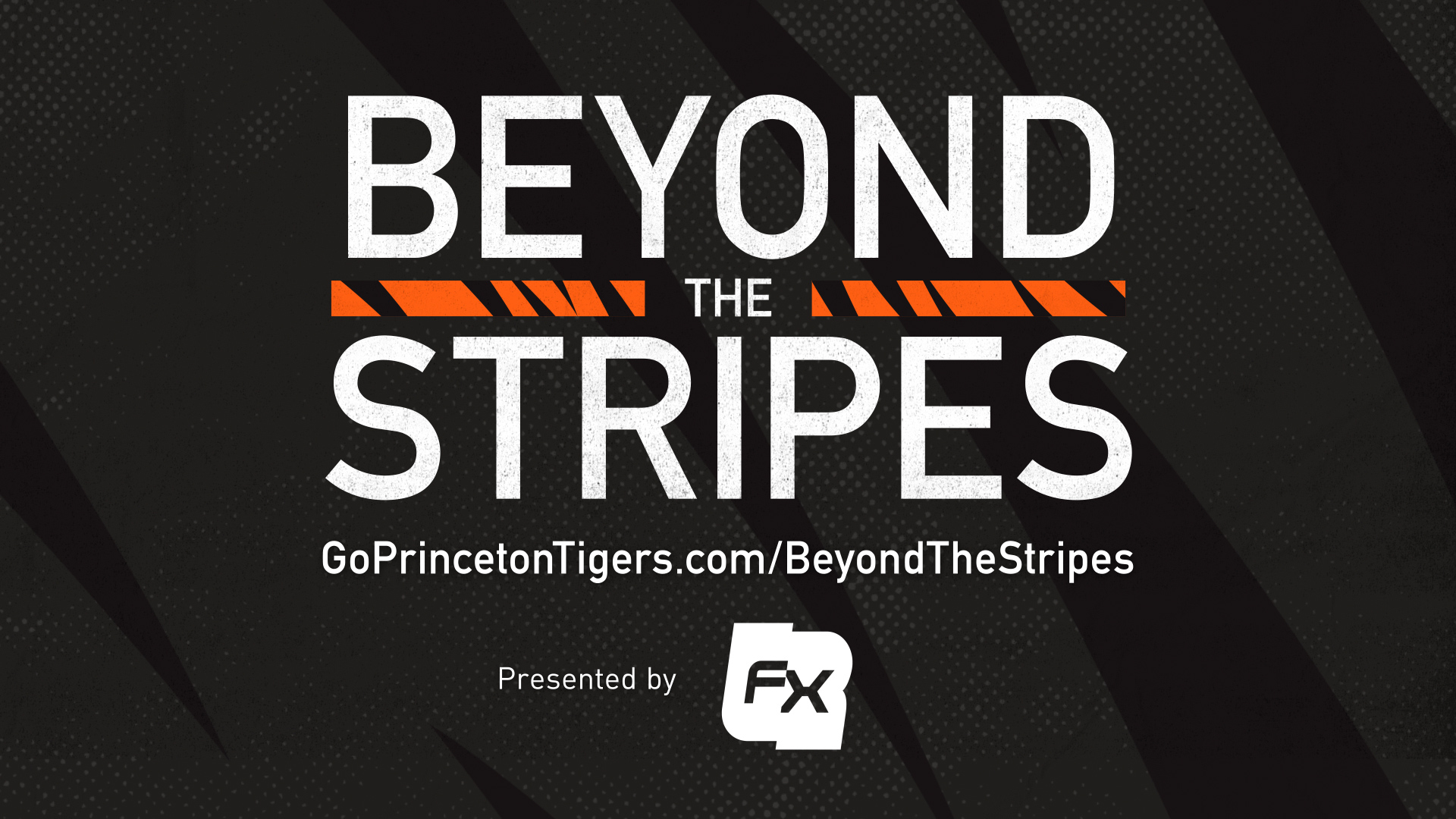
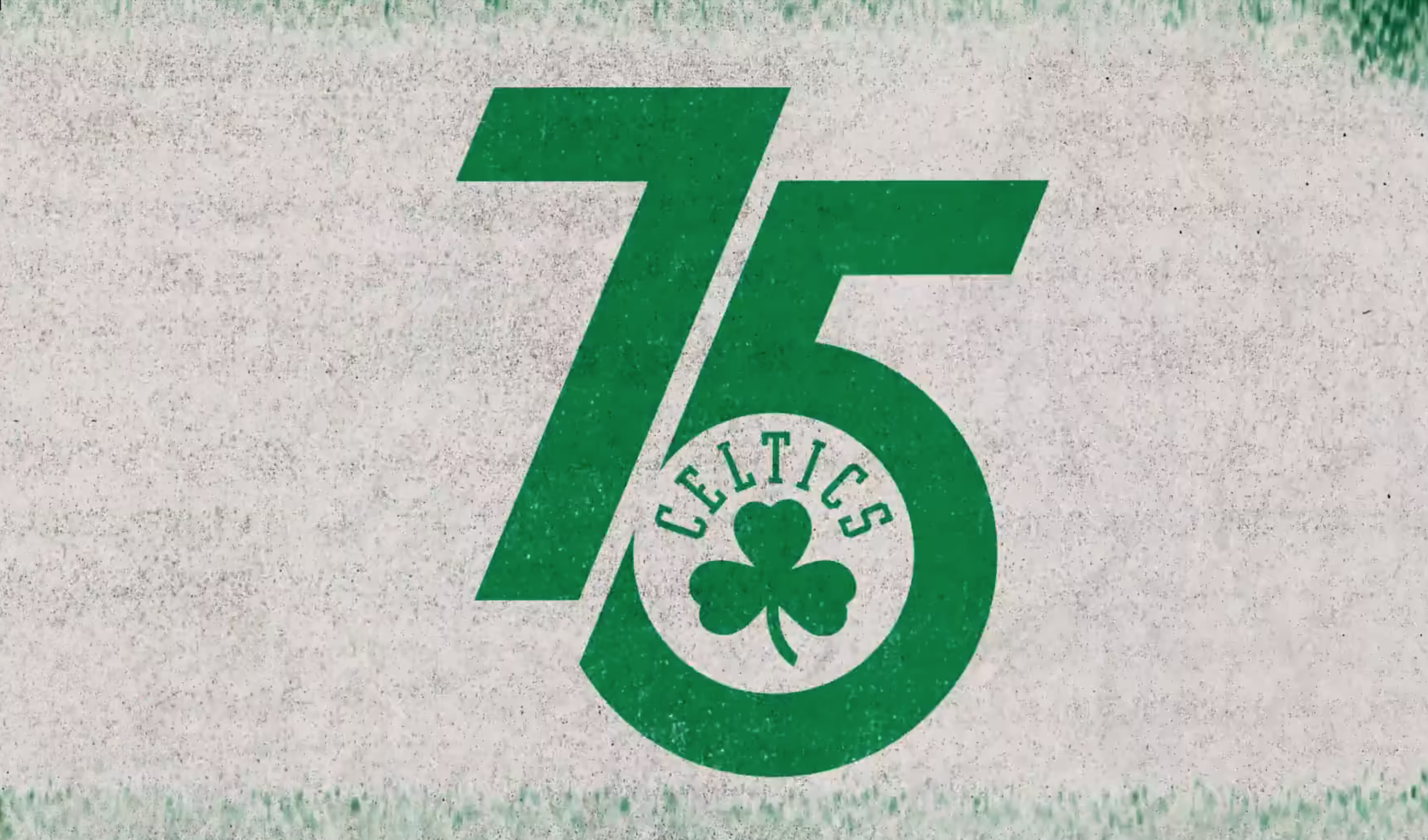
2021 Celtics Motion Branding
- Task: Create cohesive look + feel across video content assets
- Parameters: Focus on 75th Anniversary; Needs to work in 16:9 + square formats
- Credits: Typeface (taken from names on back of jersey's) and logos created by Keith Sliney + Jack Wu
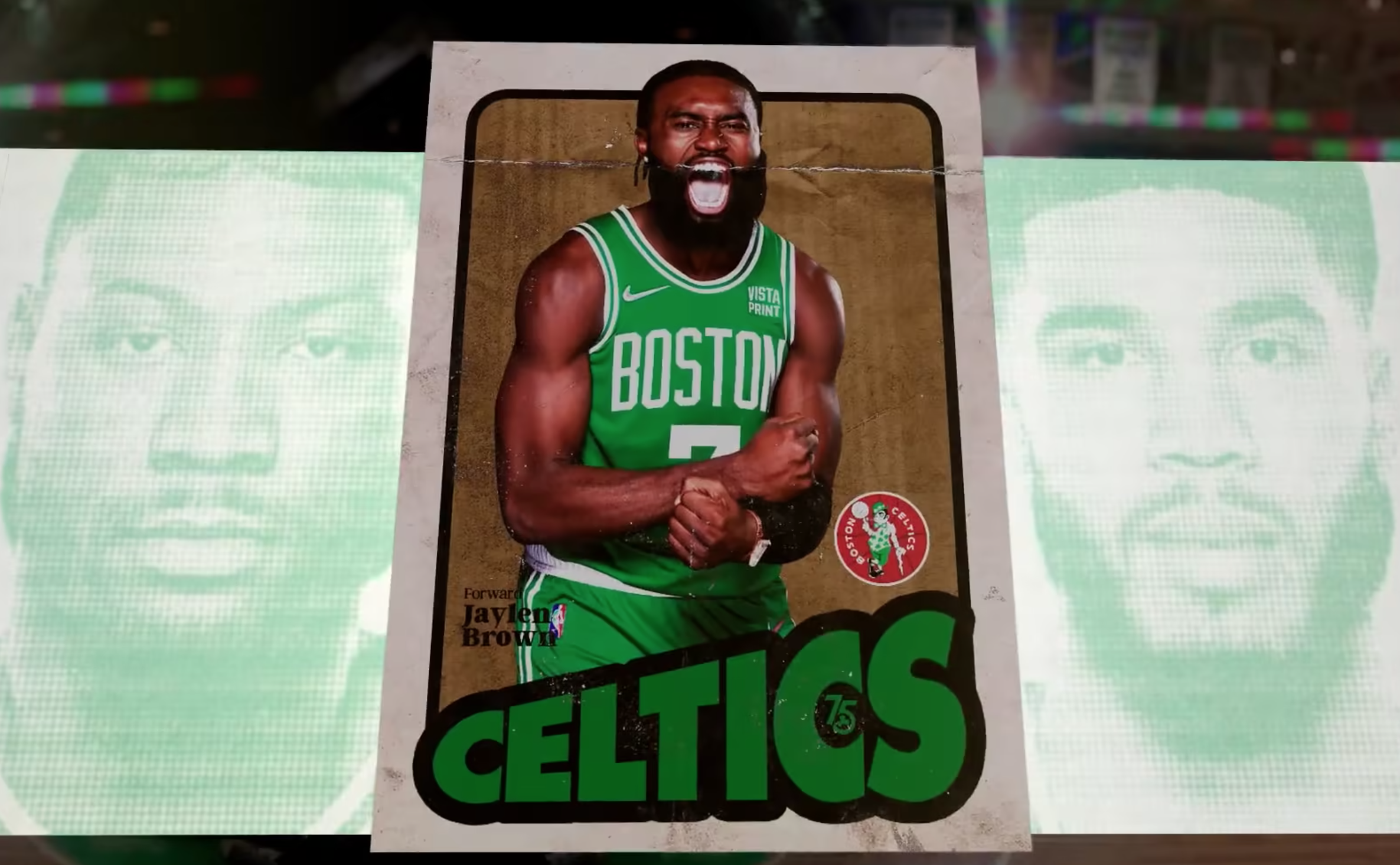
Our brand look + feel heading into the season was built around the 75th anniversary. My foundational words I used as the backbone for execution were "vintage" and "headlines."
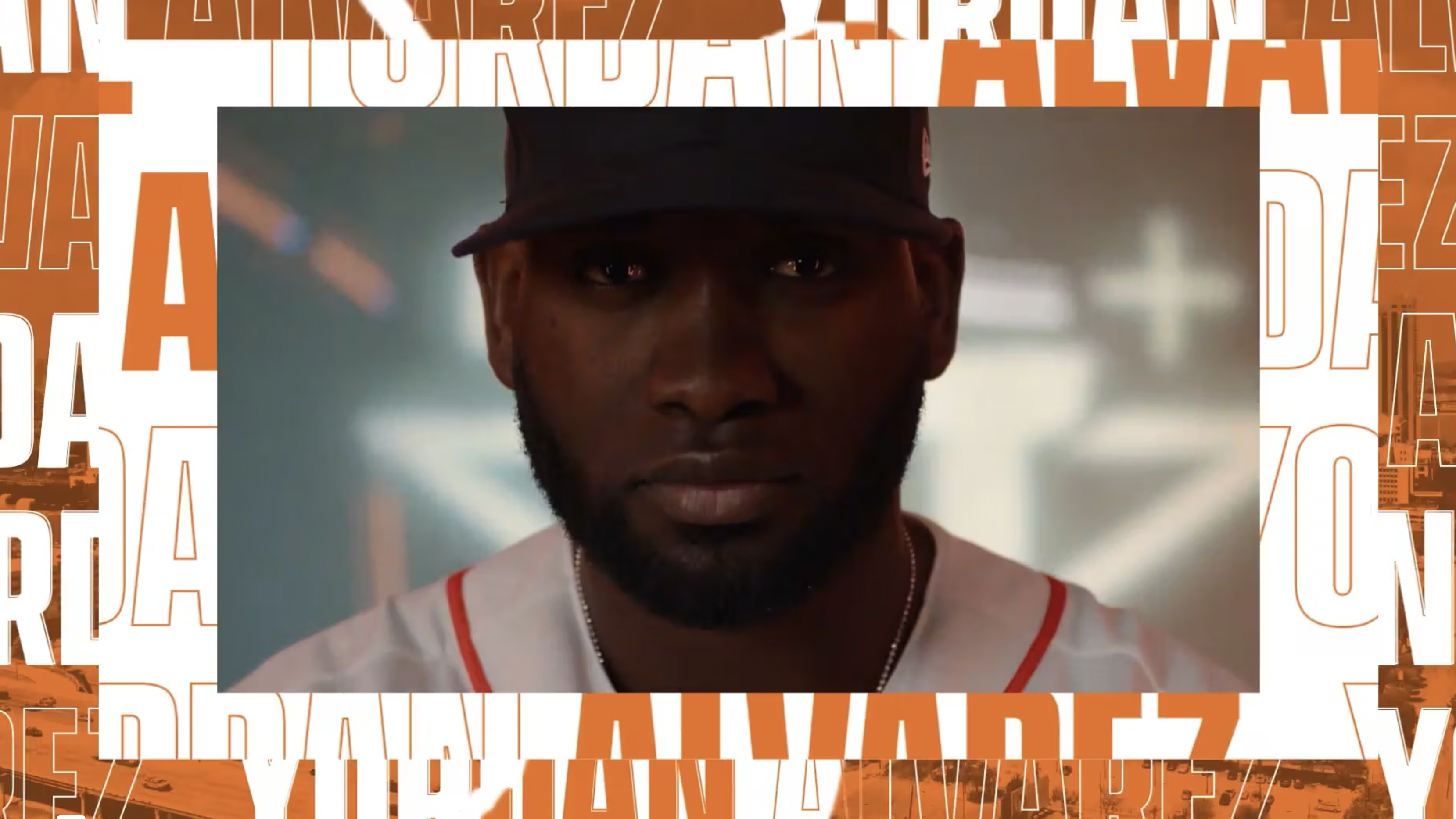
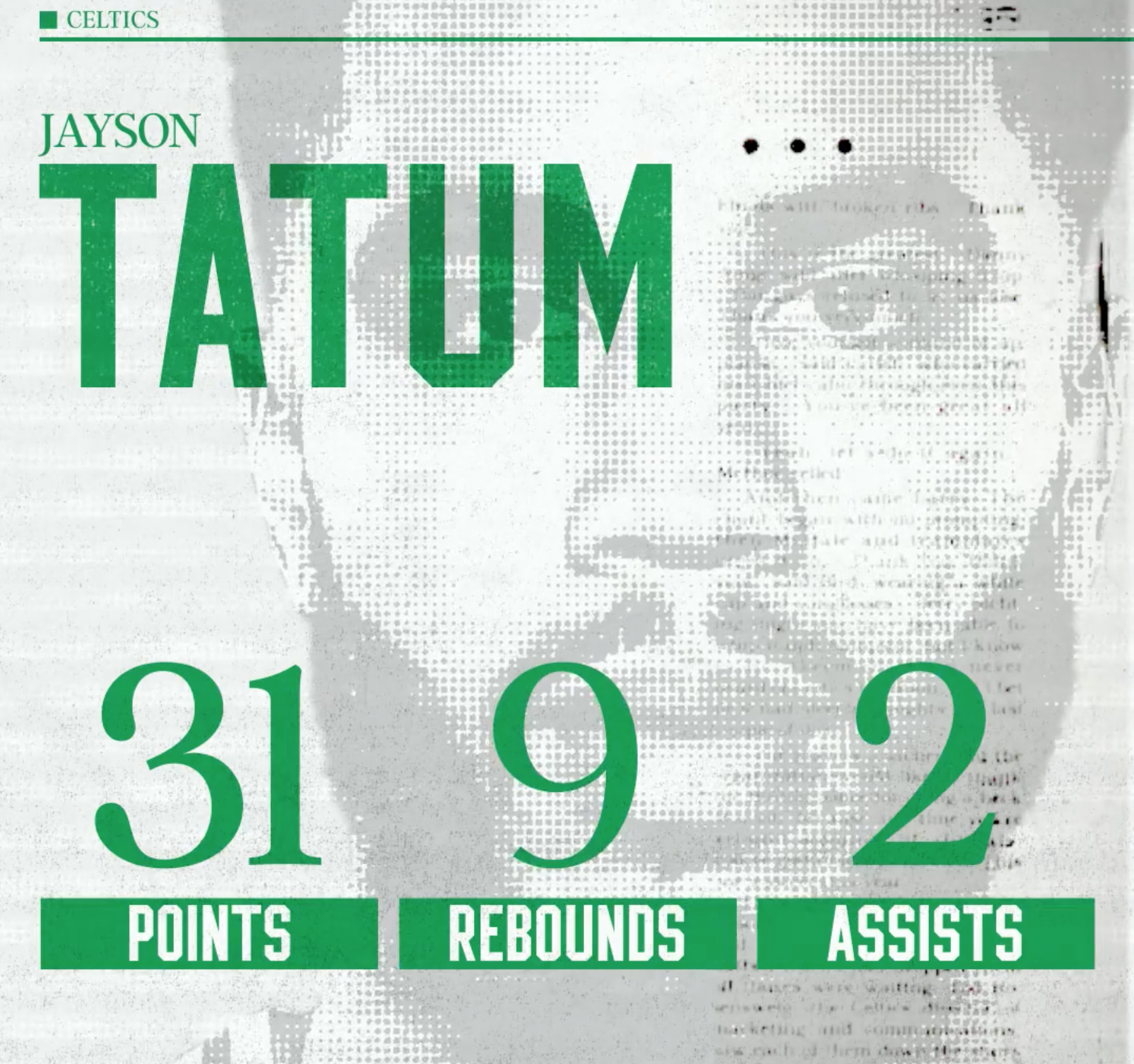
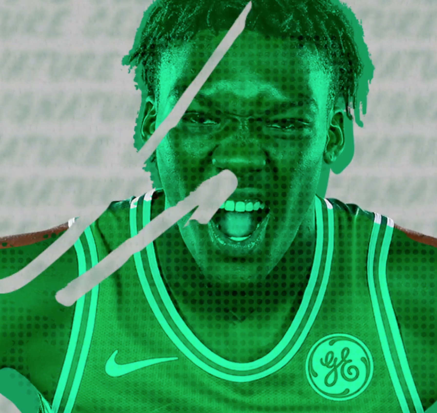
Vintage harkens back to our deep history. Newspapers and grain form the text elements. Hand created editor style brush elements animated in Photoshop reinforce the vintage look that is replicated throughout the package. Player images are treated with halftone, and crushed with levels to appear like they were in the newspaper. Playing up the recognizable Celtics 3-stripe pattern, I exchanged gold for the white stripe as a nod to the championship history.
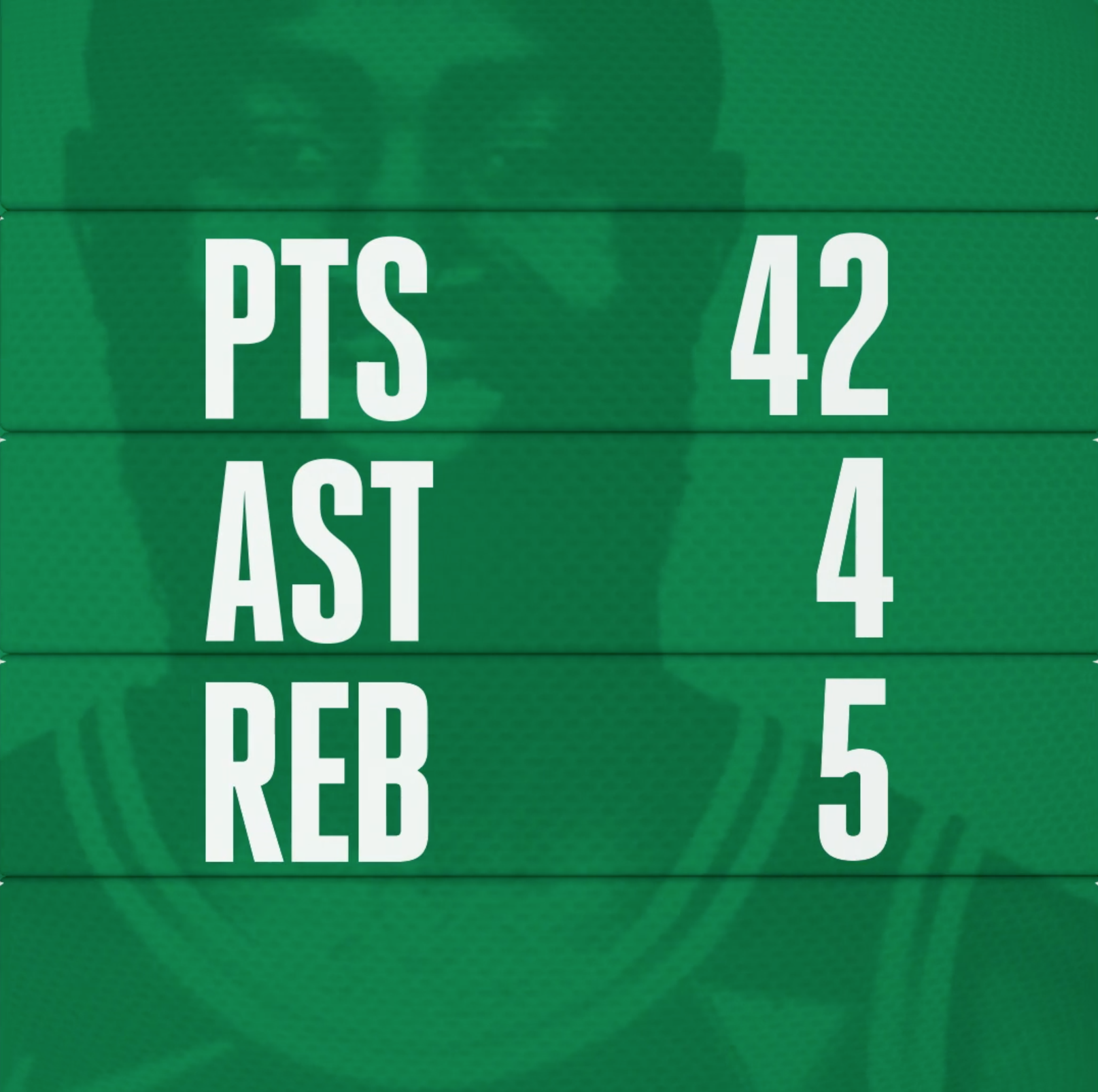
Headlines are big and bold. Using the bespoke typeface, I used inspiration from old jersey nameplates as the fundamental element and tied it back to the newspaper look by having the text "type on" to reveal the headline of the content. Right before the lockup, newspapers fly at the screen to drive energy and create a moment of impact for the title to resolve. Editor's marks are used to dynamically reveal the title.
To tie it all together, I added a stop motion type feel by using a posterizeTime expression so the movement felt more like film.
Biggest challenge in creating this motion package was building it to work for 16:9 and 1:1 square formats.


Copyright © Justin Peterson | All Rights Reserved
